DAX LASTDATE vs. LASTNONBLANK

In my previous blog post I discussed how the time intelligence function CLOSINGBALANCEMONTH worked great, except when it didn’t. If you remember, the problem was the function CLOSINGBALANCEMONTH could not handle situations where the data had gaps, or blanks on specific dates.

If you missed the previous blog post, you can find it here:

In this post,  I want to build a measure that returns the closing price for the date in the current context. My initial attempt at this measure is going to suffer from the same issue we faced when working with the CLOSINGBALANCEMONTH function in the last blog. Let’s start by using CALCULATE and LASTDATE.

Working with LASTDATE

Here is your MSDN definition of LASTDATE: “returns the last date in the current context for the specified column of dates”.

This function is great because it works in the current context so it makes the measures you author in DAX very dynamic. For example:

  • If the current context is month, LASTDATE returns the last day of the month.
  • If the current context is Quarter, LASTDATE returns the last day of the quarter.
  • If the current context is day, the day in the current context is returned.

This means that the LASTDATE function automatically works for each level in your date hierarchy, this is why we like working with DAX, because of this type of functionality.

Let’s take a look at a simple example of LASTDATE:

image

This simple calculated measures returns the following:

image

As you can see in this screenshot, LASTDATE is returning the last date of the current context, in this visual we have the month and the year.

Next, I will create a new measure that returns the Closing Price of the current time period. The following measure returns the Closing Price of the stock for the last day of the month:

image

If we take a look at the results in our table visual, we will see that our measure is returning blanks for certain months. The reason this is occurring is because the stock market isn’t open every day of the year, therefore, if there is no closing price for the last day of the month then a blank value is returned.

image

LASTNONBLANK function in DAX

I discussed the LASTNONBLANK function in my previous blog post, so I won’t get too detailed here but here is the definition and syntax from MSDN:

Definition: Returns the last value in the column, filtered by the current context, where the expression is not blank.

Syntax: LASTNONBLANK(<column>, <expression>)

LASTNONBLANK will return the last date in the current context that wasn’t blank, that is the perfect function for this scenario.

image

Let’s take a look at the results of LASTNONBLANK compared to LASTDATE. In the highlighted sections below, notice that for each area where the close price is blank the results of the LASTDATE function and LASTNONBLANK function differ. As previously discussed, the stock market was closed on the last date of the month and therefore the close price does not return a value.

image

Now it’s time to modify the Close Price measure so that it returns the last close price for the current context:

image

Here are the final results:

image

Thanks for reading, enjoy!

Advertisement

How to add Data Labels to maps in Power BI

Recently, I was asked if the values for maps could be shown on the map and of course the first thing I thought was to just turn on data labels. Well, if you’re reading this then you already know there isn’t currently a way to add data labels. Now, I say currently because the Power BI team is always making changes and it could one day be there.

image

First, this was not my idea. When I realized there was not a data label option I knew someone in the community would have figured out a work around, and I was right!

Thanks to the awesome people who contribute at community.powerbi.com the answer was only a “google kungfu” search away. If you would like to see the original forum post where Sean “Super Contributor” helped out another Power BI user then check out the following URL:

https://community.powerbi.com/t5/Desktop/Data-Labels-on-Maps/td-p/79118

This blog is going to take a look at the following  three items:

  • Why this workaround works
  • How to set this up and configure it
  • Concerns and issues with this method

Why this workaround works

The map visual in Power BI will allow you to display the value of whatever is allocated to the Location field of the map. Generally you would simply put the country, state, city,  or some other valid location in this field. The limitation is that this field can only be populated with a calculated column. Therefore, Sean suggested combining the value you wanted to display into a calculated column field. Well, that allows you to now display the results, but it doesn’t map the data. The next step is you will need to have the latitude and longitude for each geographical location that needs to be mapped. The latitude and longitude coordinates will be added to the map visual to determine location and the location field will be used to display the data label.

Setup and configuration of Data Labels on Maps in Power BI!

Now, let’s dig in and build this out.

First, make sure your geography table has the required latitude and longitude columns. My geography table goes down to the zip code level of detail but I only brought in the Latitude and Longitude at the State level since I knew this is how I wanted to view the data in my map visual.

image

Next, it’s time to build the calculated column that will help you display the data.

  • Create a new calculated column on the Geography table.
  • The following DAX expression returns Total Sales by State combined with the state name.
  • I also added the FORMAT function to add some formatting to the values.
  • The part highlighted in the red box returns the Total Sales by State.

image

Now that the you have your latitude and longitudes and the calculated column has been built, it’s time to add this to a map! In the below screenshot I highlight where each of your fields should be assigned.

image

Finally, it’s time to display our Location on the map!

  • Under formatting options turn on Category Labels
  • Feel free to change the properties for color, text size, show background and transparency.

image

Concerns and Issues

First of all, you must store your values in a calculated column in order to display them.

  • This means that your values will be static, they won’t change as slicers change.
  • You need to know exactly what and how your end users will use the data, which is nearly impossible.
  • This column will take up resources in your data model.

Secondly, you must have the latitude and longitude for every location you want to put on your map.

  • It may be difficult to obtain a quality list of latitudes and longitudes for each address.
  • These additional columns in your data model will have a high level of uniqueness and will definitely consume valuable memory resources.

Enjoy!

Quick Tips–Updating Parameters from the PBI Service

In this quick tip I want to share how you can update Parameters in Power BI from the service. Previously, this was not an option and Parameters could only be updated from Power BI Desktop.

Updating Parameters in Power BI

To update parameters, navigate to the Datasets section in the Power BI Service. Next, click on the schedule refresh icon. Updating parameters is done from the schedule refresh window.

SNAGHTML20f21a8d

Click on Parameters from the schedule refresh window. Once expanded you will see available parameters, simply update the parameters and you’re done!

image

Thanks for reading!

Quick Tips – Connecting to a SharePoint Folder in Power BI

Recently, when teaching the Advanced Power BI Course by Pragmatic Works, I had a student ask how to use the SharePoint Folder in Power BI. She had been struggling with getting it to work correctly. After trying a few different URLS I could see why she was having a problem. Since you’re reading this, you are probably having the same kind of issues. The error message is actually pretty good, but a little confusing. When the error says “the site’s root URL only.” I took this to mean SharePoint’s URL, however, it actually means the URL of the site within SharePoint.

The URL isn’t valid. Please enter the site’s root URL only.

image

Let’s take a look at how you can properly connect to a SharePoint Folder in Power BI and extract the files.

Connecting to a SharePoint Folder in Power BI

In my first attempt I tried connecting to simply the root of my SharePoint site.

https://pragmaticworksonline.sharepoint.com

image

This only allowed access to the Shared Documents folder on the root and therefore didn’t work.

image

As you can see in the above image, this only allowed access to the Shared Documents folder on the root of the SharePoint site.

Connecting to a specific SharePoint site

Next, I tried connecting directly to the root of a particular site. I connected to the training site on SharePoint using the following URL:

image

This worked, the SharePoint folder option will traverse subfolders, just like the default from folder option. Therefore, if you are looking for a particular directory then you can simply apply a filter in the Power Query Editor on the Folder Path property.

Thanks for reading this blog!

Unexpected Totals in DAX (Part 3)

At some point or another every DAX author realizes that the total row is not the sum of each row/cell in a given column. This can be quite confusing and is exactly why I am writing a third blog post dedicated to the total row.  If you missed part one or part two in this series you can find them below:

Part 1: Unexpected Totals in DAX (Part 1)

Part 2: Unexpected Totals in DAX (Part 2)

Problem

In this blog, we want to return YTD Sales for previous months and Forecast YTD Sales for the current month. Therefore, there should be only one measure and that measure should return YTD Sales or Forecast YTD based on the month.

In the following table there are three measures, the first measure is YTD Sales and it tracks the actual sales. The second measure is Forecast YTD Sales and this is the forecasted sales. The third measure is the Dynamic Measure, this is the proposed measure designed to replace the other two measures. However, the total row produces unexpected results, and therefore is perfect for this blog post:

SNAGHTML1168985d

In the above screenshot, the total row for the dynamic measure is displaying $19,582,120 but the sum of all the rows is actually $28,164,680. Let’s take a look at the dynamic measure and figure out why the total row is not what we might expect.

Dynamic Measure

The “Dynamic Measure” is returning the YTD Sales for completed months and returning the Forecast YTD Sales for the current month. Let’s take a quick look at the measure just to understand better what is going on. Please note, for this example we assume there are sales for every day of the year.

image

  • A = Two variables to make the code more readable (See descriptions below):
    • LastSaleDate = Return the last day the company had a sale (in the current filter context)
    • LastDayOfMonth = Return the last day from the date table (in the current filter context)
  • B = The logical test performed by the IF function.
    • If the two variables don’t match, then it is the current month and [Forecast YTD Sales] is returned.
    • If the two variables do match, then it is a completed month and [YTD Sales] is returned.

Filter Context of the Total Row

The total row is executing the dynamic measure within the context at the total row. What is the last day in the date table within the current filter context? At the total row it is 12/31/2008, there is a filter on the report page that filters the report down to only the year 2008. The last day that there was a valid sale was on 6/20/2008. Since 12/31/2008 does not equal 6/20/2008 the calculation returns Forecasted YTD Sales, which at the total level is $19,582,120.60.

Steps to solve this problem:

  1. Determine if the calculation is at the total row.
  2. For the total row perform the Dynamic Measure calculation for each month in the table separately.
  3. Sum the results of each result separately.

However, steps two and three above are a little bit more complex than they sound and therefore to complete the solution we need to introduce you to two new functions in the DAX language: VALUES and SUMX. The great news is this is a design pattern that you will be able to use in many different scenarios!

The VALUES function in DAX

MSDN Definition:
Returns a one-column table that contains the distinct values from the specified table or column.

Remember step 2 from above? We want to execute our dynamic measure against each row in the table, the VALUES function will get us the distinct list of the months. Let’s take a look at the VALUES function in action. I have created a table using the following formula to display the results:

SNAGHTML11aaa388

image

The VALUES function returned a distinct list of months. This is exactly what we need. Now, how do we execute our measure against each row in this table and then SUM all the results at the very end to get the expected value at the total row? SUMX!!

Working with the SUMX Function in DAX

MSDN Definition: Returns the sum of an expression evaluated for each row in a table.

Syntax:

image

Perfect! The SUMX function is going to iterate over the list of months and execute the dynamic measure against each month. After this process has completed the SUMX function will then SUM the results returned for each month.

SUMX accepts two parameters, the first parameter is a table and the second parameter is the expression. The table that is returned from the VALUES function is the first parameter and the dynamic measure is passed in as the second parameter (expression). Let’s take a look at the final solution.

Solution

The following solution now returns the expected results for the total row:

image

Here are the results, pay special attention to the total row:

image

Thanks for reading my post!

Unexpected Totals in DAX (Part 2)

In a previous blog post we discussed how to replace the total row with a blank value, primarily to eliminate confusion. You can find the original post here: Unexpected Totals in DAX (Part 1)

In this post we want to go a step further and replace the total row with our own DAX calculation.

image_thumb5

Our goal is to replace the value of 8,691 with the value of 1,005. The value of 1,005 is the total number of new homes listed on the market in 2016, which in our case is the last year or current year of the data set we are looking at. This is slightly more challenging though, because our date table goes to the year 2018. But just wait, we will get to that shortly.

Let’s take a look at the steps to solve this problem:

  1. Identify if the calculation is at the total row, we will use HASONEVALUE as we did in the previous blog post.
  2. Determine the MAX year in the data set with homes on market, not the last year in your date table, but the last year with actual homes listed on the market.
  3. Write a calculation that returns the New Homes on Market for the last year in the data set.

I am going to create a new measure so we can look at the two measures side by side.

image

I have modified the original DAX calculation, here we first check to see if we are at the total row using HASONEVALUE, if we are at the total row then we return blank. If this doesn’t make sense, please stop and go back to Part 1 where I cover this in detail.

  • A = Check to see if the current filter context has one value, if not, then we are at total row.
  • B = If there is more than one year in the filter context, replace with a blank value.

Determine the last year with homes listed.

Now that the total row has been identified, it’s time to author a DAX formula that returns the total homes listed for the last year in our data. The last year with homes listed in our data is 2016, therefore we need to write a DAX formula that reads like this:

Return the number of new homes listed in 2016.

Now, technically we can’t write the year 2016 in our formula because we know that this would no longer work once we move into the next year and we need our DAX formula to be dynamic (automated) and change with the years. Here is our first attempt at getting the MAX year.

image

  • A = Return the MAX year in the Filter Context
  • B = Return the MAX year from the variable at the total row.

image

For demo and validation purposes I am displaying the results of the variable in the total row (The max year), here we can see that the results are maybe not what we would have expected. The year 2018 is the last year in our date table but not the last year that new homes were listed. One way to get the last year with homes listed is to use the function LASTNONBLANK.

LASTNONBLANK

For the sake of brevity I won’t cover LASTNONBLANK here, but I will do a separate blog series on semi-additive measures. Let’s rewrite the DAX formula:

image

Using LASTNONBLANK we now get the last year that we had new homes listed. See results below:

image

Perfect! The hard part is over, now we simply count the total rows where the listing date of the home equals the year 2016.

image

Here is the final result:

image

As always, thanks for reading and I hope this helped!

Unexpected Totals in DAX (Part 1)

DAX is an awesome language and when paired with properly created relationships, DAX can add significant analytical value to your data models with minimum effort. But, you already knew that! So why are we here? Well, sometimes, DAX can produce results that are unexpected and this is usually very noticeable when looking at the totals row.

image

So why do we get unexpected results at the total row? Why doesn’t the total row simply return the sum of all the rows in a specified column? The simple answer is your DAX calculation is also computed for the total row and operates within the contexts of the total row. Let’s take a look at the previous screenshot.

In this example, the total row is returning all homes listed for all years in the filter context, this is in fact the sum of all the rows in the column. However, you may expect to only see the homes newly listed on the market for the latest time period, in this case that would be how many homes were listed in 2016. The result of 8,691 homes listed in the total row is not wrong or incorrect, it depends on what you are specifically looking for, it could definitely be unexpected depending on your analytical needs. If you do not wish to see the total of all homes ever listed in the current filter context then you have a couple of options available to you.

There are generally 3 ways you could address incorrect / unexpected totals.

  1. Pretend the problem doesn’t exist. (ProTip: Don’t ignore problems.)
  2. Identify when the DAX calculation is being evaluated for the total row and return a BLANK value.
  3. Identify when the DAX calculation is being evaluated for the total row and perform a different calculation.

In this blog post you are going to learn how to return blank to eliminate any confusion. In a future blog post you will learn how to use DAX to change the value of the total row.

HASONEVALUE function in DAX

In this simple example, the total row is the sum of all the rows, but this is not what we want. What we would want to show at the total row is how many homes have recently been listed for sale, not the total of all homes that have ever been listed. The first thing we must do is identify if we are at a total row. The way I do this is by using the function HASONEVALUE.

MSDN Definition:

HASONEVALUE: Returns TRUE when the context for the columnName has been filtered down to one distinct value only. Otherwise FALSE.

In the screenshot below I created a new measure called “Totals” and in this measure the function HASONEVALUE is used to correctly identify which row is the total row. This works because at the total level the filter context is all years, so the function returns FALSE.

image

The final step is to now use conditional logic and replace the Total row with a blank value.

BLANK() function in DAX

New Homes on Market (2)=
IF(
    HASONEVALUE(‘Date'[Year]),
    [New Homes on Market],
   BLANK())

SNAGHTMLde25f4f

Now the total row is no longer confusing or misleading. In part two of this series I am going to take this a step further and show how to use DAX to return your expected results at the total row instead of just returning blank!

Further Reading: Rob Collie over at PowerPivotPro has a great blog post on HASONEVALUE vs. ISFILTERED vs. HASONEFILTER:
https://powerpivotpro.com/2013/03/hasonevalue-vs-isfiltered-vs-hasonefilter/

Thanks!

Quick Tips – Mapping Geography Data in Power BI

One challenge of working with data of a geographical nature is that sometimes, it can be mapped incorrectly. In this quick post I want to give you a couple of tips that will help you to reduce, if not eliminate, incorrect mappings of your data!

There are a few different methods you can use to try to solve the issue of incorrect mapping of geographical data.

  1. Use hierarchies in your map visuals, hierarchies store relationships between attributes and can help with mapping a lot. A geography hierarchy might look something like the following: Country –> State –> City – > Zip
  2. Use data categorization. Sometimes a state can share the name with a city or a country. I remember years ago when I heard on the news that Georgia was under attack, that was pretty concerning for me since Florida is very close to Georgia ha ha. Of course, the state of Georgia was not under attack, it was the country! We can use data categorization in Power BI to specify that a column is a city, state, zip, or country.
  3. Remove ambiguity, for example, instead of having a city column, create a new column with the city and state. Then you can assign that new column a data categorization of Place. If you have millions of potential combinations then this may not be feasible within Power BI, this column would have terrible compression and most likely exceed any memory limits. However, this method works great.

Using hierarchies in Power BI to map geography data types

Take a look at the screenshot below, the State/Province of Nord in France is being incorrectly mapped to Lebanon.

image

Fortunately, this one can be solved very easily by using hierarchies. Nord, by itself, is not clear enough for Bing maps, however, if we add the country to the visual as well, then the picture becomes clearer and Nord will be properly mapped to France.

1) Add the Country to the Location. The country should show up above the state in the location list as seen in the following screenshot:

Add Country to Location

After adding the country, the map is at the highest level and you would want to now drill down to show the next level in the hierarchy. In the animated gif below, you will notice that Nord is now being mapped correctly in France!

Visual Drilldown

Using the PLACE data categorization in Power BI to map geographical data

In the following image, you will notice the map visual has been filtered down to the state California in the United States and therefore only the cities that exist in California should be displayed. Yet, the map visual is a little confused, and this happens because multiple states could have the same city name.

image

To solve this confusion you want to remove the ambiguity here and create a new calculated column with the city and state combined. Next, assign the new column a data category of Place. See demo below:

DataCategoryPlace

Replace the column city in your map visual with the new column city, state. Here is the final result, the cities are now mapped correctly and only cities directly related to California appear on the map:

image

Thanks for checking out this “Quick Tips” blog. Please check out my YouTube channel to find more Power BI related material!

Quick Tips – Quickly Changing Connections in Power BI

Hopefully, you don’t have to go in and change your connection strings often in Power BI, but when you do, you will want to know this little trick.

What’s not covered: Parameters

In this blog I’m not going to discuss parameters, although as a developer, I love that parameters are available for administration. Even better, the use of parameters in Power BI became even more powerful with the recent update to Power BI where parameters can now be changed in the Power BI Service! I will definitely do a blog or series on parameters in the near future.

What is covered: Power Query Editor & Data Source Settings

As a trainer, I come across the issue of needing to change connection string information quite often and this saves me a lot of time. Let’s jump right in. In this example, I have a power bi report with two separate data sources and a total of eight tables.

image

  • The first data source is to an excel file with many different sheets.
  • The second data source is a separate excel file.

Imagine that both excel files get moved from one directory location to another directory location. Typically this would mean that I would need to individually update the connection information for all eight tables in my data model. However, I’m here to show you a better way.

Launch the Power Query Editor

You will be making source connection changes from the Power Query Editor. Launch the Power Query Editor by clicking on “Edit Queries” found on the Home ribbon.

image

This will launch the Power Query Editor. Next, click “Data source settings” found on the Home ribbon.

image

This launches the Data source settings window and you will be able to see all of your connections here. If you had twelve tables all coming from the same excel file or a SQL Server database, ect… then you would only need to change one connection for all twelve tables. You get the idea!

Select the first connection in your list you want to update and then click on Change Source…

SNAGHTML2fc8e1db

This will launch a new window that allows you to quickly make source changes, this window will look slightly different depending on your data source. This example is loading data from an excel file, therefore the following window is provided for making changes:

image

After clicking browse, you can now browse to the new file location. In this example, the file has moved over to the DAX Advanced folder so I want to point to that directory and file, as you see below:

image

Once the file has been selected, click Open. Click OK. Now all seven tables that were pointing to that AdventureWorksDW excel file have been updated at one time. Repeat this process for any remaining data sources that may need updating and you are done!

I hope you enjoyed this Quick Tip!

Power BI–Problem, Design, Solution (Text Search)


There is a video that walks you through the solution in depth, please find the video at the end of this post along with the completed solution.

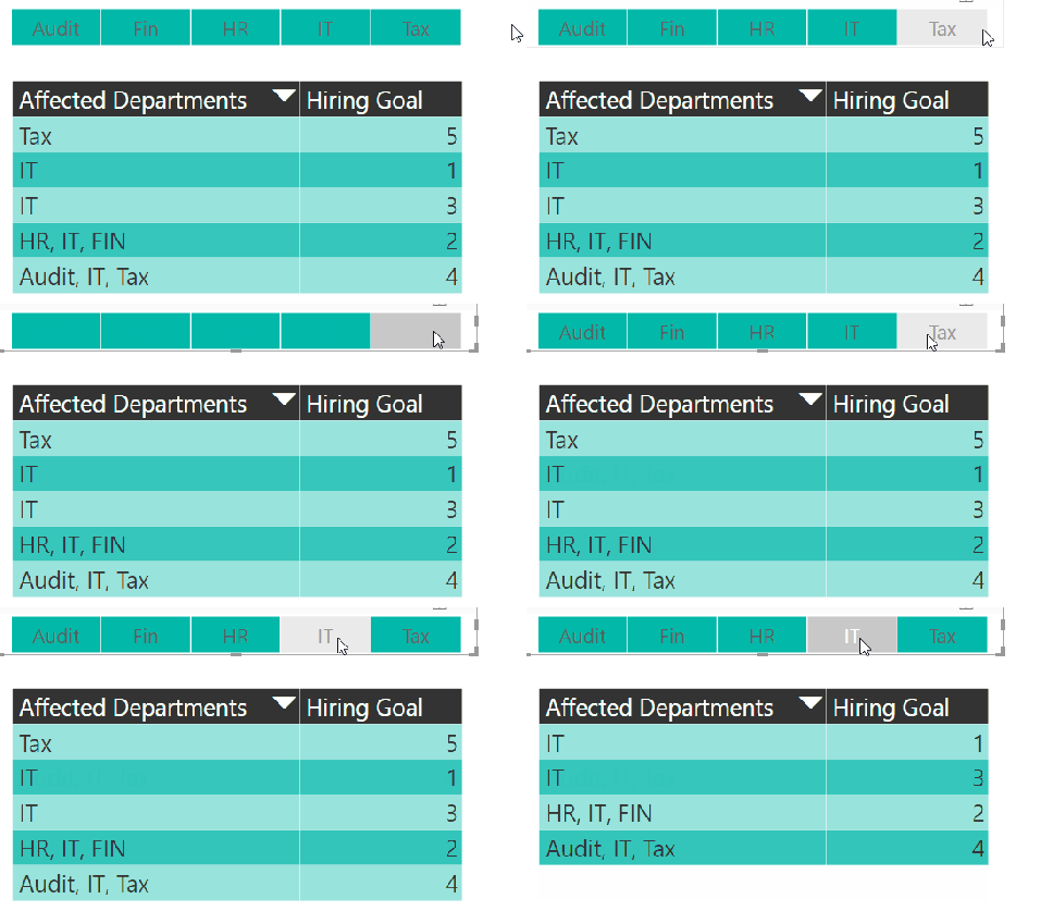
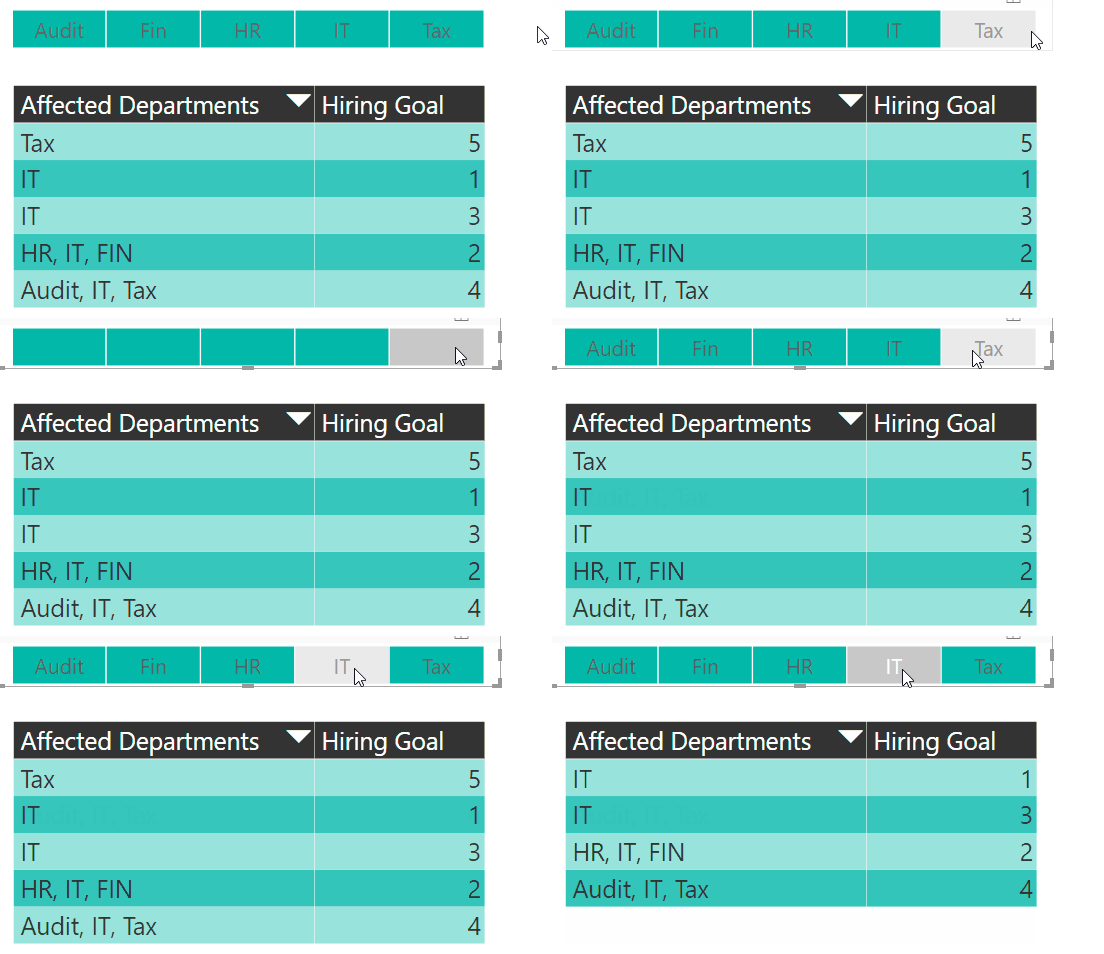
In this installment of the Problem, Design, Solution series we are going to show you how to perform a text search using slicers in Power BI, this simulates a “LIKE” type search. In the following screenshot you can see that when “Tax” is selected all records in the table that have “Tax” anywhere in the record are returned, likewise whenever “IT” is selected from the slicer all records in the table that have IT in them are returned. Hope you enjoy this post!

Solution_LikeSearch

Problem

Normally slicers (visual filters) only filter records that are an exact match, for example, if you select “IT” from the slicer then you would only expect to see records that have IT and only IT in the record, if it does not match IT exactly then those records are not returned. This is the intended behavior of a slicer and in general, this is exactly what we want. However, there are times when you might want to do a “LIKE” type search similar to the like function in T-SQL. In this scenario, we had a client who needed to do this exact thing. The screenshot below is our simulated problem for this example.

In order to bring back all records that contain “IT” you are required to click each occurrence of “IT” in your slicer, of course, this isn’t a big problem if you have a small number of possible combinations like our sample size. In larger environments, this may be an unreasonable expectation!

Problem_LikeSearch

Design

Now that we have discussed both the problem and what we want the ultimate solution to look like, it is time to lay out the design. The design includes a four step process.

Let’s break this down a little bit:

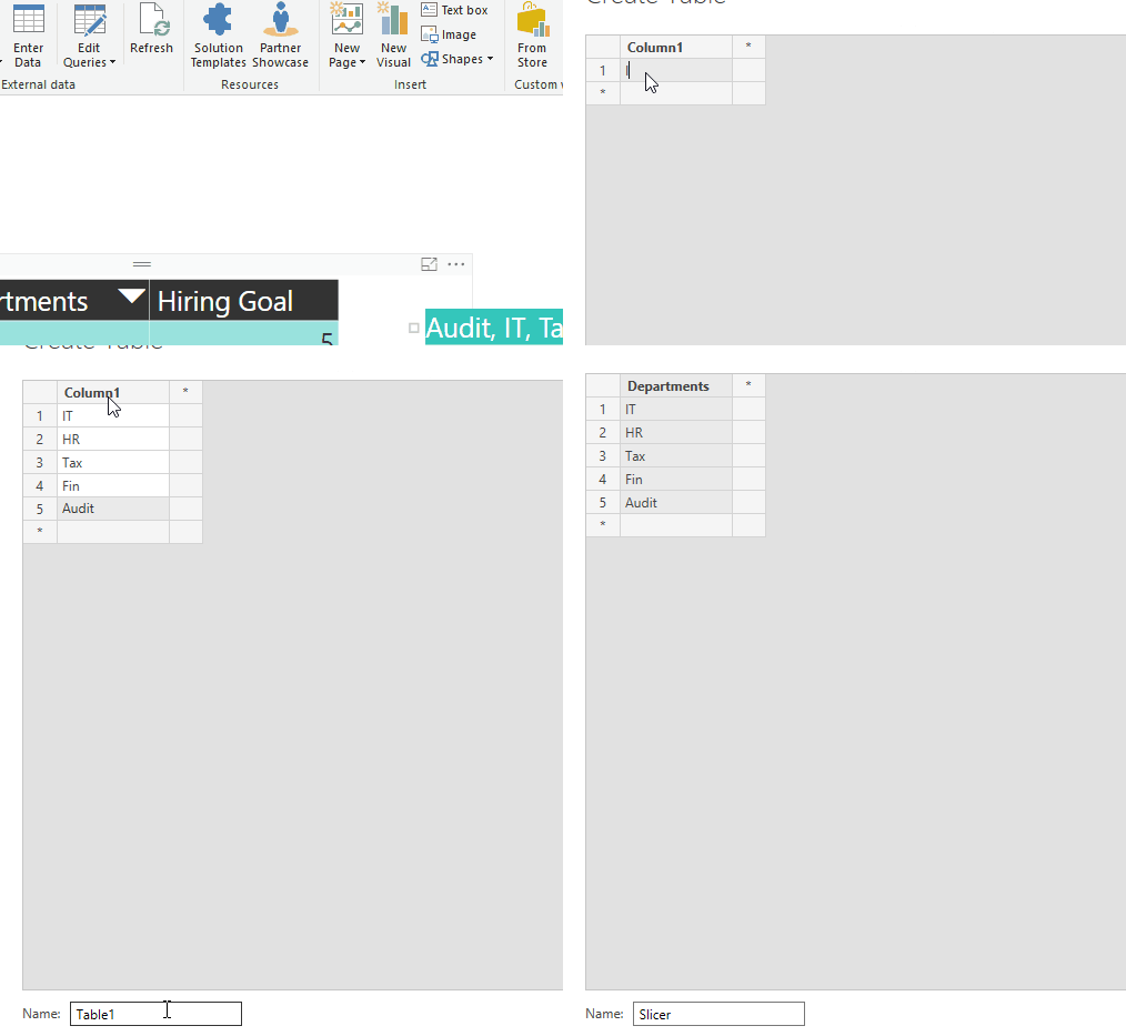
  • The first step in the process is to identify all the unique values that we need to filter on and put those values into their own distinct table, in this case, we are looking at departments (HR, IT, FIN, Audit, and Tax).
  • The second step is to create a measure that uses the distinct departments in our new table as a filter. We will call this measure IsFiltered.
  • The third step is to create a new slicer using the values listed in our disconnected table.
  • The final step is to tie our new measure (IsFiltered) to the specific visual that we want to be affected by our disconnected table of distinct values.

Step 1 – Loading unique values in a distinct table

I would recommend storing this list of values in a file or in a table in a database, for this example I will quickly put these values into a table in my PBIX file. Navigate to the home ribbon and select “Enter Data”, I will name the column Departments and the table Slicer, next I will add the five distinct departments as records for the departments’ column (IT, HR, Tax, FIN, Audit).

Note: This is using the disconnected table design, we are not going to set up a relationship between this new table and any other table in our model.

Step 1_LikeSearch

Step 2 – Creating the IsFiltered measure

This IsFiltered measure is going to give us the “LIKE” type search that we are looking for! Excited yet?? Well, you should be! In this example I am going to use the FIND function, the find function is exactly like the SEARCH function with the key difference being that the FIND function is case-sensitive and the SEARCH function is case-insensitive. The code below will complete step 2 in our design.

IsFiltered =
IF(
SUMX(‘Slicer’,
FIND(
‘Slicer'[Departments],
MAX(‘Department Goals'[Affected Departments]),,0)) > 0,
True“,
False
)

What is this measure doing? The FIND function returns the starting position of the text string we pass in, if the value is greater than 0 then that means that the text exists and this is how we generate a LIKE type search. If the text is not found then nothing is returned and we give that record a default value of 0.

Step 3 – Create a slicer from the disconnected table

Now we can create a slicer from our distinct list of values. At this point the slicer does not filter anything, this is because the filtering occurs through the measure we created in step 2 and needs to be added as a filter to a visual or report in our Power BI Report.

image

Step 4 – Use the IsFiltered measure to filter a visual in the report

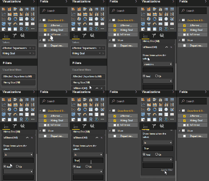
The last step in this process is about as easy as step 3, first we need to figure out which visuals we want to be filtered with the “LIKE” type operation and then we need to use the IsFiltered measure as a filter on those visuals. The criteria here will be to only show the records where the result is “True”. Remember the DAX calculation from above? If a value was found, then a number higher than 0 is returned and we flag the record as “True”!

Finally, I am going to add the IsFiltered measure as a filter to my table visualization, this is done in the Fields section of the visualizations pane. See the below image:

Step 2_LikeSearch


Solution

With the 4 step design completed, the solution is also complete! Now we can apply a filter that does a text search rather than an exact match, see the image below:

Solution_LikeSearch

Summary

By leveraging the DAX expression language we are able to override the default behavior of slicers and filters in Power BI. Please note that this solution would also work in an SSAS Tabular model, the implementation would be slightly altered as you may be consuming that model from excel rather than Power BI but it would work nonetheless!

Resources

Video of the solution:

Completed Example:

http://tinyurl.com/yd2qon7x